Description
/* === Scoped CSS Rules Start === */ .tesery-product-description-container { font-family: ‘Inter’, system-ui, sans-serif; color: var(–text-dark, #333); line-height: 1.6; padding: 0; /* Remove overall padding from container for full width sections */ background-color: transparent; /* No background color as requested */ } .tesery-product-description-container section { padding: 40px 24px; /* Default section padding */ max-width: 100%; /* Ensure sections go wide */ margin: 0 auto; box-sizing: border-box; /* Include padding in element’s total width and height */ } .tesery-product-description-container h2 { color: var(–accent-color, #333); /* Changed to dark grey */ text-align: center; margin: 0 0 1.5em; font-size: 2.8em; /* Larger heading for impact */ line-height: 1.2; } .tesery-product-description-container h3 { color: var(–accent-color, #333); /* Changed to dark grey */ margin: 2.5em 0 1em; /* Adjusted margins */ font-size: 1.8em; /* Larger subheading */ text-align: center; } .tesery-product-description-container p { color: var(–text-medium, #4a4a4a); max-width: 800px; /* Constrain text width for readability */ margin: 1em auto; text-align: center; } /* Hero Section Specifics – Updated for Left Image, Right Text */ .tesery-hero-section { background: linear-gradient(180deg, var(–bg-primary) 0%, var(–crisp-white) 100%); /* Changed to a subtle gradient from light grey to white for smoother transition */ padding: 60px 24px; display: flex; /* Use flexbox for content centering */ flex-direction: column; /* Stack content vertically */ justify-content: center; align-items: center; text-align: center; /* Fallback for older browsers/if flex not applied */ } /* Value Propositions (now at the very top, inside Hero Section) */ .tesery-hero-section .prop-grid { display: flex; justify-content: center; flex-wrap: wrap; gap: 20px; max-width: 1200px; margin-bottom: 40px; /* Added margin to separate from hero content */ } .tesery-hero-section .prop-item { display: flex; align-items: center; background: var(–bg-secondary, #f0f0f0); /* Light grey for prop items */ border-radius: 50px; /* Pill shape */ padding: 10px 20px; font-weight: 600; color: var(–text-dark); font-size: 1.1em; white-space: nowrap; box-shadow: 0 2px 10px rgba(0, 0, 0, 0.05); } .tesery-hero-section .prop-item span { /* Style for the bullet points */ font-size: 1.2em; /* Keep size for bullet */ margin-right: 8px; color: var(–accent-color); /* Uses dark grey accent */ } .tesery-hero-section .hero-content-wrapper { display: flex; flex-direction: row; /* Default for desktop: image left, text right */ align-items: center; /* Vertically align items */ gap: 40px; /* Space between image and text */ max-width: 1200px; /* Max width for the content wrapper */ width: 100%; /* Take full available width within parent */ margin: 0 auto; /* Center the content wrapper */ } .tesery-hero-section .hero-image-wrapper { flex: 1; /* Adjusted to 1 for half-half split */ min-width: 250px; max-width: 600px; text-align: center; /* Center image within its flexible container */ } .tesery-hero-section .hero-image { /* Renamed from hero-banner for clarity */ width: 100%; /* Make image responsive within its wrapper */ height: auto; max-width: 600px; display: block; /* Remove extra space below image */ margin: 0 auto; /* Center image within its wrapper if it’s smaller than max-width */ border-radius: var(–border-radius, 16px); box-shadow: var(–shadow-medium, 0 8px 40px rgba(0, 0, 0, 0.12)); } .tesery-hero-section .hero-text-content { flex: 1; /* Adjusted to 1 for half-half split */ text-align: left; /* Align text to the left */ } .tesery-hero-section h1 { font-size: 3.5em; color: var(–primary-color, #1a1a1a); margin-bottom: 0.2em; line-height: 1.1; text-align: left; /* Ensure text alignment */ } .tesery-hero-section .hero-description { /* New style for the added description */ font-size: 1.1em; color: var(–text-medium); margin: 0.5em 0 1em; /* Adjust margin for placement */ text-align: left; } .tesery-hero-section .subtitle { font-size: 1.5em; color: var(–text-medium); margin-bottom: 1.5em; font-style: italic; text-align: left; /* Ensure text alignment */ } .tesery-hero-section .brand-button { margin: 0; /* Remove auto margin to align left */ display: inline-block; /* For text-align to work on parent */ } .tesery-product-description-container .prop-item { display: flex; align-items: center; background: var(–bg-secondary, #f0f0f0); /* Light grey for prop items */ border-radius: 50px; /* Pill shape */ padding: 10px 20px; font-weight: 600; color: var(–text-dark); font-size: 1.1em; white-space: nowrap; box-shadow: 0 2px 10px rgba(0, 0, 0, 0.05); } /* Feature Grid – Reused and enhanced */ .tesery-feature-grid-section { background: linear-gradient(180deg, var(–crisp-white) 0%, var(–bg-secondary) 100%); /* Applied gradient from white to light grey */ } .tesery-product-description-container .feature-grid { display: grid; grid-template-columns: repeat(auto-fit, minmax(300px, 1fr)); gap: 24px; max-width: 1200px; /* Confine to a max-width for better layout */ margin: 2em auto; } .tesery-product-description-container .feature-card { background: var(–crisp-white); /* Card background is white */ padding: 24px; border-radius: var(–border-radius, 16px); box-shadow: var(–shadow-light, 0 4px 20px rgba(0, 0, 0, 0.08)); border: 1px solid var(–border-color, #e5e7eb); transition: all 0.3s ease; text-align: center; display: flex; /* Flexbox for consistent alignment */ flex-direction: column; justify-content: space-between; } .tesery-product-description-container .feature-card:hover { transform: translateY(-5px); box-shadow: var(–shadow-medium, 0 8px 40px rgba(0, 0, 0, 0.12)); border-color: var(–accent-light, #666); /* Changed to medium grey */ } .tesery-product-description-container .feature-card h4 { font-size: 1.4em; color: var(–accent-color, #333); /* Changed to dark grey */ margin-bottom: 12px; } .tesery-product-description-container .feature-card p { font-size: 0.95em; color: var(–text-medium, #4a4a4a); line-height: 1.7; margin: 0 auto 15px; /* Adjust margin */ } .tesery-product-description-container .feature-card img { max-width: 100%; height: auto; border-radius: var(–border-radius, 8px); margin-top: auto; /* Push image to bottom */ box-shadow: var(–shadow-light, 0 4px 20px rgba(0, 0, 0, 0.08)); } /* Adjust feature icon sizing and styling */ .tesery-product-description-container .feature-icon { font-size: 2.8rem; /* Larger icon */ margin-bottom: 15px; display: inline-block; color: var(–accent-color, #333); /* Changed to dark grey */ background: none; } /* Before & After Section */ .tesery-before-after-section { background: var(–bg-primary, #fff); text-align: center; } .tesery-compare-wrapper { display: flex; flex-wrap: wrap; justify-content: center; gap: 20px; margin-top: 2em; } .tesery-compare-wrapper .image-box { flex: 1 1 45%; /* Adjusted for two images on desktop */ max-width: 500px; text-align: center; } .tesery-compare-wrapper .image-box img { width: 100%; height: auto; border-radius: var(–border-radius, 16px); box-shadow: var(–shadow-medium, 0 8px 40px rgba(0, 0, 0, 0.12)); } .tesery-compare-wrapper .image-box p { font-weight: 600; margin-top: 10px; font-size: 1.1em; color: var(–accent-color, #333); } /* Video Section */ .tesery-video-section { background: var(–bg-secondary, #f5f5f5); text-align: center; } .tesery-video-section .video-container { max-width: 100%; /* Ensure it’s full width for responsive design */ margin: 2em auto; border-radius: var(–border-radius, 16px); overflow: hidden; box-shadow: var(–shadow-medium, 0 8px 40px rgba(0, 0, 0, 0.12)); } .tesery-video-section iframe { width: 100%; height: 56.25vw; /* 16:9 aspect ratio (9/16 = 0.5625) */ max-height: 675px; /* Max height for video on larger screens */ display: block; } /* Package Contents Section */ .tesery-package-list-section { background: linear-gradient(180deg, var(–bg-primary) 0%, var(–bg-secondary) 100%); text-align: center; } .tesery-package-list-section .package-list { display: flex; flex-wrap: wrap; justify-content: center; gap: 24px; margin-top: 2em; } .tesery-package-list-section .package-item { background: var(–crisp-white); border: 1px solid var(–border-color, #e5e7eb); border-radius: var(–border-radius, 16px); padding: 20px; text-align: center; box-shadow: var(–shadow-light, 0 4px 20px rgba(0, 0, 0, 0.08)); transition: transform 0.3s ease; flex: 1 1 200px; /* Adjusted for flexibility */ max-width: 300px; } .tesery-package-list-section .package-item:hover { transform: translateY(-5px); box-shadow: var(–shadow-medium, 0 8px 40px rgba(0, 0, 0, 0.12)); } .tesery-package-list-section .package-item img { max-width: 100%; height: auto; border-radius: var(–border-radius, 8px); margin-bottom: 15px; } .tesery-package-list-section .package-item h4 { font-size: 1.2em; color: var(–accent-color, #333); margin: 0; } /* FAQ Section */ .tesery-faq-section { background: linear-gradient(180deg, var(–bg-secondary) 0%, var(–crisp-white) 100%); /* Applied gradient from light grey to white */ box-shadow: var(–shadow-light, 0 4px 20px rgba(0, 0, 0, 0.08)); } .tesery-product-description-container .faq-section-content { /* New wrapper for FAQ items */ margin: 2em auto; max-width: 900px; /* Constrain FAQ width for readability */ text-align: left; /* Ensure FAQ content is left aligned */ } .tesery-product-description-container .faq-item { margin-bottom: 12px; background: var(–crisp-white); /* Use crisp white */ border-radius: var(–border-radius, 16px); border: 1px solid var(–border-color, #e5e7eb); transition: all 0.3s ease; overflow: hidden; } .tesery-product-description-container .faq-item:hover { box-shadow: var(–shadow-medium, 0 8px 40px rgba(0, 0, 0, 0.12)); border-color: var(–accent-light, #666); /* Changed to medium grey */ } /* Using details/summary for FAQ for better interactivity */ .tesery-product-description-container .faq-item details { border: none; } .tesery-product-description-container .faq-item summary { padding: 20px 56px 20px 24px; font-weight: 600; font-size: 1.05rem; cursor: pointer; color: var(–text-dark); transition: all 0.3s ease; position: relative; list-style: none; outline: none; user-select: none; background: transparent; text-align: left; /* Ensure summary is left aligned */ } .tesery-product-description-container .faq-item summary::-webkit-details-marker { display: none; } .tesery-product-description-container .faq-item summary::after { content: ‘+’; position: absolute; right: 24px; top: 50%; transform: translateY(-50%); font-size: 20px; color: var(–accent-color, #333); /* Changed to dark grey */ transition: all 0.3s ease; font-weight: 300; line-height: 1; } .tesery-product-description-container .faq-item details[open] summary::after { content: ‘−’; transform: translateY(-50%) rotate(0deg); } .tesery-product-description-container .faq-item summary:hover { background: rgba(0, 0, 0, 0.02); /* Subtle hover for b/w */ } .tesery-product-description-container .faq-content { padding: 0 24px 20px; color: var(–text-medium); line-height: 1.6; animation: fadeIn 0.3s ease-in-out; text-align: left; /* FAQ answers aligned left – Re-verified */ } @keyframes fadeIn { from { opacity: 0; transform: translateY(-10px); } to { opacity: 1; transform: translateY(0); } } /* Trust Section */ .tesery-trust-section { background: linear-gradient(180deg, var(–crisp-white) 0%, var(–bg-secondary) 100%); /* Applied gradient from white to light grey */ } .tesery-product-description-container .trust-section-content { max-width: 1000px; /* Reviews section wider */ margin: 0 auto; text-align: center; } .tesery-product-description-container .review-container { display: flex; flex-wrap: wrap; justify-content: center; gap: 24px; margin: 2em 0; } .tesery-product-description-container .review-box { flex: 1; min-width: 300px; max-width: 45%; border: 1px solid var(–border-color, #e2e8f0); border-radius: var(–border-radius, 8px); padding: 20px; background: white; box-shadow: var(–shadow-light, 0 4px 20px rgba(0, 0, 0, 0.08)); transition: all 0.3s ease; display: flex; flex-direction: column; justify-content: space-between; } .tesery-product-description-container .review-box:hover { transform: translateY(-5px); box-shadow: var(–shadow-medium, 0 8px 40px rgba(0, 0, 0, 0.12)); } .tesery-product-description-container .review-header { display: flex; align-items: center; margin-bottom: 12px; } .tesery-product-description-container .review-avatar { width: 48px; height: 48px; border-radius: 50%; background: var(–bg-secondary, #e0e0e0); /* Grey for avatar background */ color: var(–star-yellow, #d4af37); /* Keep star yellow */ display: flex; align-items: center; justify-content: center; font-weight: bold; margin-right: 12px; font-size: 1.2em; flex-shrink: 0; } .tesery-product-description-container .review-stars { color: var(–star-yellow, #ffd700); /* Keep star yellow */ margin-right: 4px; font-size: 1.1em; } .tesery-product-description-container .review-stars+span { font-weight: 600; color: var(–text-dark); } .tesery-product-description-container .testimonial { font-style: italic; color: var(–text-medium, #666); margin: 1em 0 0; padding-left: 0; border-left: none; font-size: 1em; } /* Call to Action */ .tesery-cta-section { background: var(–accent-color, #333); /* Dark grey background for CTA */ color: white; padding: 60px 24px; text-align: center; } .tesery-cta-section h2 { color: white; font-size: 2.5em; margin-bottom: 0.5em; } .tesery-cta-section p { color: var(–crisp-white); margin-bottom: 2em; font-size: 1.2em; } .tesery-product-description-container .brand-button { background: white; /* White button on colored background */ color: var(–accent-color, #333); /* Button text dark grey */ padding: 16px 40px; border-radius: 50px; font-weight: 700; text-transform: none; font-size: 1.2em; transition: all 0.4s ease; border: none; cursor: pointer; margin: 0 auto; /* Center button within CTA section */ display: block; max-width: 320px; box-shadow: 0 10px 30px rgba(0, 0, 0, 0.2); position: relative; overflow: hidden; } .tesery-product-description-container .brand-button::before { content: ”; position: absolute; top: 0; left: -100%; width: 100%; height: 100%; background: linear-gradient(90deg, transparent, rgba(255, 255, 255, 0.2), transparent); /* White subtle gradient */ transition: left 0.5s; } .tesery-product-description-container .brand-button:hover::before { left: 100%; } .tesery-product-description-container .brand-button:hover { transform: translateY(-3px); box-shadow: 0 15px 40px rgba(0, 0, 0, 0.3); color: var(–accent-color); /* Maintain color */ } .tesery-product-description-container .brand-button a { text-decoration: none; color: inherit; display: block; } /* Responsive adjustments */ @media (max-width: 1024px) { .tesery-hero-section .hero-image { max-width: 90%; } .tesery-product-description-container .feature-grid { max-width: 90%; } .tesery-product-description-container .faq-section-content { max-width: 90%; } .tesery-product-description-container .trust-section-content { max-width: 90%; } } @media (max-width: 768px) { .tesery-product-description-container section { padding: 30px 16px; } .tesery-product-description-container h2 { font-size: 2.2em; } .tesery-product-description-container h3 { font-size: 1.6em; margin: 2em 0 0.8em; } /* Hero Section Responsive */ .tesery-hero-section .hero-content-wrapper { flex-direction: column; text-align: center; /* Center content when stacked */ } .tesery-hero-section .hero-image-wrapper { text-align: center; /* Center image when stacked */ margin-bottom: 20px; /* Space below image when stacked */ } .tesery-hero-section .hero-text-content { text-align: center; /* Center text when stacked */ } .tesery-hero-section h1, .tesery-hero-section .hero-description, /* Apply to new description */ .tesery-hero-section .subtitle { text-align: center; } .tesery-hero-section .brand-button { margin: 0 auto; /* Center button when stacked */ } .tesery-hero-section h1 { font-size: 2.8em; } .tesery-hero-section .subtitle { font-size: 1.2em; } .tesery-hero-section .hero-image { max-width: 95%; } .tesery-hero-section .prop-grid { margin-bottom: 20px; /* Adjusted responsive margin for top props */ } .tesery-product-description-container .prop-item { font-size: 1em; padding: 8px 15px; } .tesery-product-description-container .prop-item span { font-size: 1em; } .tesery-product-description-container .feature-grid { grid-template-columns: 1fr; gap: 16px; } .tesery-product-description-container .feature-card { padding: 18px; } .tesery-product-description-container .feature-icon { font-size: 2.5rem; margin-bottom: 10px; } .tesery-product-description-container .feature-card h4 { font-size: 1.2em; } .tesery-product-description-container .faq-item summary { padding: 16px 44px 16px 20px; font-size: 0.95rem; } .tesery-product-description-container .faq-item summary::after { right: 20px; font-size: 18px; } .tesery-product-description-container .faq-content { padding: 0 20px 16px; font-size: 0.9rem; } .tesery-product-description-container .review-container { flex-direction: column; align-items: center; gap: 16px; } .tesery-product-description-container .review-box { max-width: 90%; margin: 0; padding: 16px; } .tesery-product-description-container .review-avatar { width: 40px; height: 40px; margin-right: 10px; font-size: 1em; } .tesery-cta-section h2 { font-size: 2em; } .tesery-cta-section p { font-size: 1.1em; } .tesery-product-description-container .brand-button { padding: 14px 30px; font-size: 1em; max-width: 280px; } } @media (max-width: 480px) { .tesery-product-description-container section { padding: 20px 12px; } .tesery-product-description-container h2 { font-size: 1.8em; } .tesery-product-description-container h3 { font-size: 1.4em; } .tesery-hero-section h1 { font-size: 2.2em; } .tesery-hero-section .subtitle { font-size: 1.1em; } .tesery-product-description-container .prop-grid { flex-direction: column; /* Stack props on very small screens */ align-items: center; } .tesery-product-description-container .prop-item { font-size: 0.9em; } .tesery-product-description-container .feature-card { padding: 16px; } .tesery-product-description-container .feature-icon { font-size: 2.2rem; } .tesery-product-description-container .faq-item summary { padding: 12px 40px 12px 16px; font-size: 0.9rem; } .tesery-product-description-container .faq-item summary::after { right: 16px; font-size: 16px; } .tesery-product-description-container .faq-content { padding: 0 16px 12px; font-size: 0.85rem; } .tesery-cta-section h2 { font-size: 1.8em; } .tesery-cta-section p { font-size: 1em; } .tesery-product-description-container .brand-button { padding: 12px 25px; font-size: 0.9em; max-width: 250px; } } /* === Scoped CSS Rules End === */ :root { –primary-color: #1a1a1a; /* Black */ –secondary-color: #2a2a2a; /* Darker Grey */ –accent-color: #333333; /* Dark Grey for headings/icons */ –accent-light: #666666; /* Medium Grey for subtle accents/hover */ –accent-secondary: #999999; /* Light Grey (less prominent) */ –warm-white: #f8f8f8; /* Off-white background */ –crisp-white: #ffffff; /* Pure white for cards/elements */ –text-dark: #1a1a1a; /* Black for main text */ –text-medium: #4a4a4a; /* Dark grey for secondary text */ –text-light: #6b7280; /* Medium grey for less important text */ –bg-primary: #fafafa; /* Very light grey */ –bg-secondary: #f0f0f0; /* Slightly darker light grey */ –border-color: #e5e7eb; /* Light grey border */ –gradient-primary: linear-gradient(135deg, #333333 0%, #111111 100%); /* Dark grey to black gradient */ –gradient-secondary: linear-gradient(135deg, #999999 0%, #666666 100%); /* Grey gradient */ –border-radius: 16px; –shadow-light: 0 4px 20px rgba(0, 0, 0, 0.08); –shadow-medium: 0 8px 40px rgba(0, 0, 0, 0.12); –shadow-heavy: 0 20px 60px rgba(0, 0, 0, 0.15); –star-yellow: #fbbf24; /* Keep yellow for stars */ }
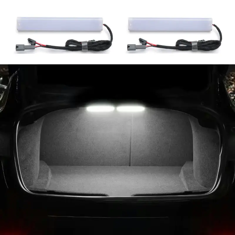
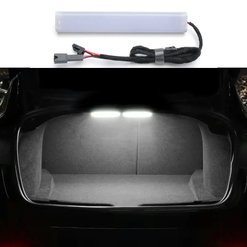
Brighten Your Trunk Space with TESERY
TESERY LED Trunk Light Bar
 •High-Brightness LEDs •Durable Design •Plug-and-Play •No Interference •Safe Adhesive •Perfect Fit
Unveiling Key Features & Benefits
•
High-Brightness LEDs
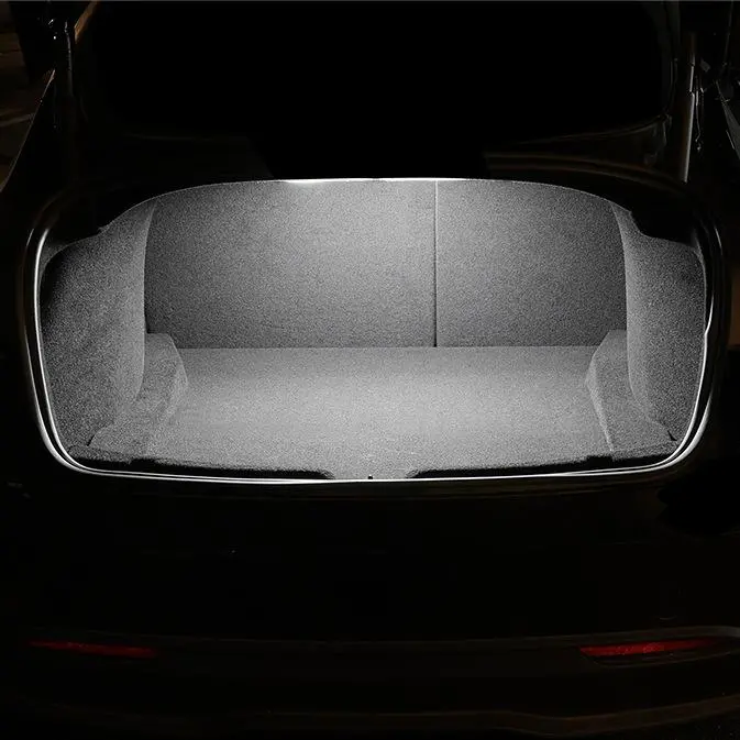
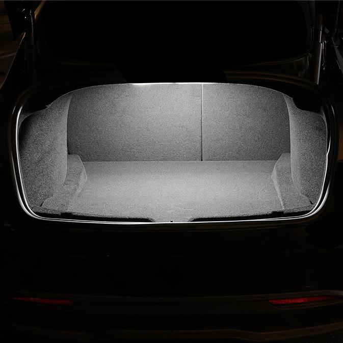
The lights use energy-efficient and high-brightness LED chips, providing significantly brighter and more long-lasting illumination than standard factory lights.
 •
•
Durable & Reliable
The thickened frame design resists heat, ensuring safe, reliable, and long-lasting performance even with continuous use.
 •
•
Plug-and-Play Installation
No complex tools or wiring required. The lights feature a dedicated adapter plug, making installation quick and effortless.
 •
•
No Interference
Designed to work seamlessly with your original trunk light, this product ensures full functionality without any electrical interference or errors.
 •
•
Perfect OEM Fitment
Custom-designed for the Tesla Model 3 and Model 3 Highland, the light bar perfectly fits the trunk contours for a clean, factory-integrated look.

Installation Guide
Frequently Asked Questions
Q: Is professional installation required?
No, these lights feature a plug-and-play design with a dedicated adapter plug, making installation quick and easy without any tools or wiring.
Q: How bright are these LED trunk lights compared to the original ones?
These lights use high-brightness LED chips, providing significantly brighter illumination than standard factory lights while remaining energy-efficient.
Q: Will the adhesive damage my car’s surface?
No, the 3mm automotive-grade adhesive is designed to be safe for your car’s paint and body. It leaves no residue or damage when removed.
Q: Can I still use the original trunk light after installing this product?
Yes, this product is designed to work alongside the factory-installed trunk light without affecting its functionality.
Q: Are the materials used in these lights eco-friendly?
Yes, the lights are made from environmentally friendly, odorless materials, ensuring they are safe and efficient for long-term use.
Verified Owners Love It!
AJ ⭐⭐⭐⭐⭐ Aiden J.
“This light bar is a game-changer! My trunk is so much brighter now, and the installation was a breeze. Highly recommend!”
KC ⭐⭐⭐⭐⭐ Kim C.
“Perfect fit for my Model 3 Highland. The adhesive is strong, and the light quality is fantastic. Looks factory-made.”
Explore more from our collection.
Reviews
There are no reviews yet.