Description
/* Global Container and Background Styles */ .tesery-product-container { background-color: #ffffff; /* Pure white background */ padding: 10px 0; font-family: ‘Inter’, -apple-system, BlinkMacSystemFont, “Segoe UI”, Roboto, “Helvetica Neue”, Arial, sans-serif, “Apple Color Emoji”, “Segoe UI Emoji”, “Segoe UI Symbol”; color: #333; /* Default body text color */ line-height: 1.6; } /* Content Max Width and Centering */ .tesery-content-wrapper { max-width: 1100px; margin: 0 auto; padding: 0 15px; } /* Universal White Card Style & HOVER EFFECT */ .tesery-card { background-color: #ffffff; padding: 30px; margin-bottom: 20px; border-radius: 12px; /* Slightly more rounded */ box-shadow: 0 4px 10px rgba(0, 0, 0, 0.08); transition: all 0.3s ease; /* Transition for hover effect */ } /* HOVER EFFECT for all cards and header */ .tesery-card:hover, .header-section:hover, .faq-item:hover { box-shadow: 0 8px 20px rgba(0, 0, 0, 0.15); /* Stronger hover shadow */ transform: translateY(-3px); /* More pronounced lift */ } /* HOVER EFFECT: Text Color Change is black */ .tesery-card:hover h2, .tesery-card:hover h3, .header-section:hover h1, .faq-label:hover span { color: #1a1a1a; /* Keep dark black color on hover */ transition: color 0.3s ease; } .header-section h1, .tesery-card h2, .tesery-card h3 { transition: color 0.3s ease; /* Ensure smooth color transition */ } /* Header Section: Title + Description + Video */ .header-section { background-color: #ffffff; text-align: center; padding: 15px 30px 0 30px; margin-bottom: 20px; border-radius: 12px; box-shadow: 0 4px 10px rgba(0, 0, 0, 0.08); transition: all 0.3s ease; /* Transition for hover effect */ } .header-section h1 { font-size: 32px; /* Larger title */ font-weight: 800; margin-bottom: 10px; color: #1a1a1a; /* Darker title color */ /* Title shadow effect */ text-shadow: 1px 1px 3px rgba(0, 0, 0, 0.15); } .header-section p { font-size: 18px; color: #333; /* Darker body text color */ margin-bottom: 25px; } /* Video Placeholder: Full Width of Module (Used in Header and Installation Guide) */ .video-placeholder { width: calc(100% + 60px); /* Extends beyond the card padding */ margin: 25px -30px 0 -30px; /* Uses negative margin to achieve full width */ max-width: none; padding-top: 56.25%; /* 16:9 ratio */ position: relative; background-color: #e0e0e0; border-radius: 0 0 12px 12px; /* Default for header bottom */ overflow: hidden; } .video-placeholder iframe { position: absolute; top: 0; left: 0; width: 100%; height: 100%; border: none; } /* Module Title (H2) */ .module-title { font-size: 28px; font-weight: 700; color: #1a1a1a; /* Darker title color */ text-align: center; margin-bottom: 25px; padding-top: 10px; /* Title shadow effect */ text-shadow: 1px 1px 2px rgba(0, 0, 0, 0.1); } /* Core Selling Points Module: 50/50 Layout */ .feature-item { display: flex; align-items: center; gap: 30px; text-align: left; padding: 30px; min-height: 250px; } /* Image Container Styles (for both feature and detail) */ .feature-image-placeholder, .detail-image-placeholder { /* MODIFIED: Changed background to white and removed inner shadow to remove gray area */ background-color: #ffffff; border-radius: 8px; overflow: hidden; position: relative; display: block; width: 100%; height: auto; aspect-ratio: 1 / 1; /* Force 1:1 square ratio (Adaptive/Square) */ box-shadow: 0 0 0 rgba(0, 0, 0, 0); /* Ensure no internal shadow */ } /* Specific Feature Image Wrapper Width (Desktop) */ .feature-image-placeholder { flex-shrink: 0; width: calc(50% – 15px); } .product-image { width: 100%; height: 100%; object-fit: cover; /* Ensures image covers the square area */ display: block; transition: opacity 0.3s ease; } .feature-text { flex-grow: 1; width: calc(50% – 15px); } .feature-text h2 { font-size: 26px; /* Slightly larger feature title */ font-weight: 700; color: #1a1a1a; /* Darker title color */ margin-top: 0; margin-bottom: 10px; } .feature-text p { font-size: 16px; color: #333; /* Darker body text color */ margin: 0; } /* Alternating Layout CSS: All items are structured (Image then Text) in HTML */ /* Items 1, 3, 5 (Odd): Image Left, Text Right (Row) */ .feature-item:nth-child(odd) { flex-direction: row; } /* Items 2, 4 (Even): Text Left, Image Right (Row Reverse) */ .feature-item:nth-child(even) { flex-direction: row-reverse; } /* Installation Guide & Component List: Two Parallel Columns */ .installation-split { display: flex; gap: 20px; margin-top: 20px; } .installation-module { flex: 1; /* Two parallel columns */ border-radius: 8px; overflow: hidden; box-shadow: 0 1px 4px rgba(0,0,0,0.08); /* Subtle internal shadow */ background-color: #ffffff; } .install-header { background-color: #f0f0f0; /* Light grey header */ color: #1a1a1a; /* Dark black */ font-weight: 700; padding: 15px; font-size: 18px; text-align: center; border-bottom: 1px solid #d0d0d0; /* Light grey border */ } .install-item { padding: 15px; border-bottom: 1px solid #eee; display: flex; justify-content: space-between; align-items: center; font-size: 15px; } .install-item:nth-child(even) { background-color: #fafafa; } .install-item:last-child { border-bottom: none; } .item-name { font-weight: 600; width: 60%; } .item-qty, .item-desc { width: 40%; text-align: right; color: #333; /* Darker text */ } /* Specific styling for the Installation Steps list */ .step-item { padding: 15px; border-bottom: 1px solid #eee; font-size: 15px; line-height: 1.5; } .step-item:nth-child(even) { background-color: #fafafa; } .step-item:last-child { border-bottom: none; } .step-item strong { color: #1a1a1a; /* Dark black emphasis */ } .table-note { font-size: 14px; color: #333; /* Darker text */ margin-top: 15px; padding: 0 15px; } /* — CSS ONLY FAQ STYLES — */ .faq-list { padding: 0; margin-top: 20px; } .faq-item { background-color: #ffffff; border-bottom: none; border-radius: 8px; margin-bottom: 10px; box-shadow: 0 1px 3px rgba(0, 0, 0, 0.1); padding: 0 15px; transition: all 0.3s ease; /* Transition for hover effect */ } /* 1. Hide the Checkbox */ .faq-input { display: none; } /* 2. Style the Label (The Clickable Question Area) */ .faq-label { padding: 15px 0; font-size: 16px; font-weight: 600; color: #1a1a1a; /* Darker title color */ cursor: pointer; display: flex; justify-content: space-between; align-items: center; user-select: none; transition: color 0.3s ease; position: relative; z-index: 10; } /* Hover label color */ .faq-item:hover .faq-label span { color: #1a1a1a; /* Keep dark black color on hover */ } .faq-icon { font-size: 24px; font-weight: normal; transition: transform 0.3s ease; line-height: 1; width: 24px; text-align: center; color: #1a1a1a; /* Dark black icon */ } /* Hover icon color */ .faq-item:hover .faq-icon { color: #1a1a1a; /* Keep dark black color on hover */ } /* 3. Initial state: Answer is hidden */ .faq-answer { padding: 0; font-size: 15px; color: #333; /* Darker text */ max-height: 0; overflow: hidden; /* Transition is crucial for the animation */ transition: max-height 0.4s ease-out, padding 0.4s ease-out; } /* 4. State Change: WHEN CHECKED, apply styles to subsequent siblings */ /* Rotate the icon when checked */ .faq-input:checked + .faq-label .faq-icon { transform: rotate(45deg); color: #1a1a1a; /* Dark black active icon */ } /* Expand the answer when checked (using the adjacent sibling selector ~) */ .faq-input:checked ~ .faq-answer { max-height: 500px; /* Needs to be larger than max content height */ padding: 0 0 15px 0; } /* Responsive Adjustments */ @media (max-width: 768px) { .tesery-card, .header-section { padding: 20px; } .header-section { padding: 10px 20px 0 20px; } .video-placeholder { width: calc(100% + 40px); margin: 25px -20px 0 -20px; } .feature-item { flex-direction: column !important; text-align: center; padding: 20px; } /* 50/50 Mobile Adjustment */ .feature-image-placeholder { width: 100%; max-width: 280px; /* Max width constraint for better look on mobile */ aspect-ratio: 1 / 1; /* Force 1:1 ratio */ margin: 0 auto; } .feature-text { width: 100%; max-width: none; height: auto; padding-top: 15px; } /* Installation Split Mobile Stack */ .installation-split { flex-direction: column; } .install-item { font-size: 14px; } .item-name { width: 50%; } .item-qty, .item-desc { width: 50%; } }
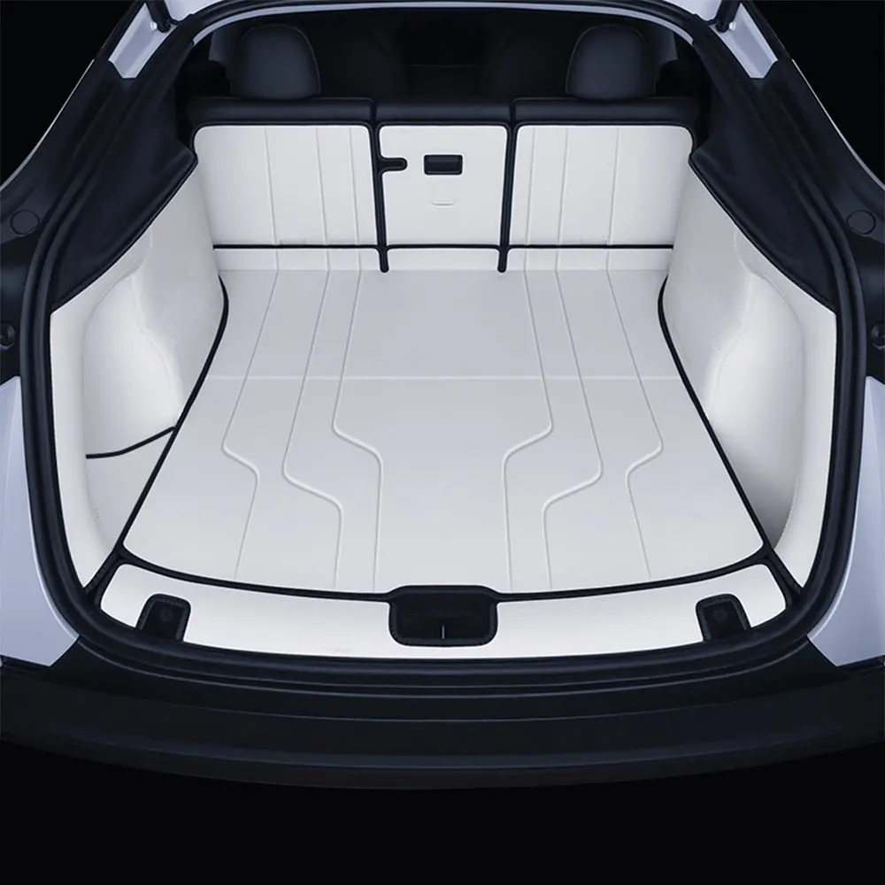
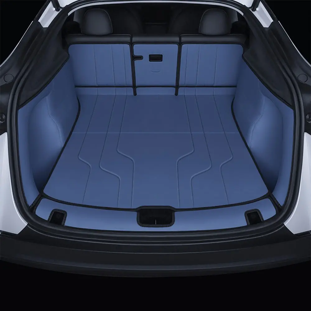
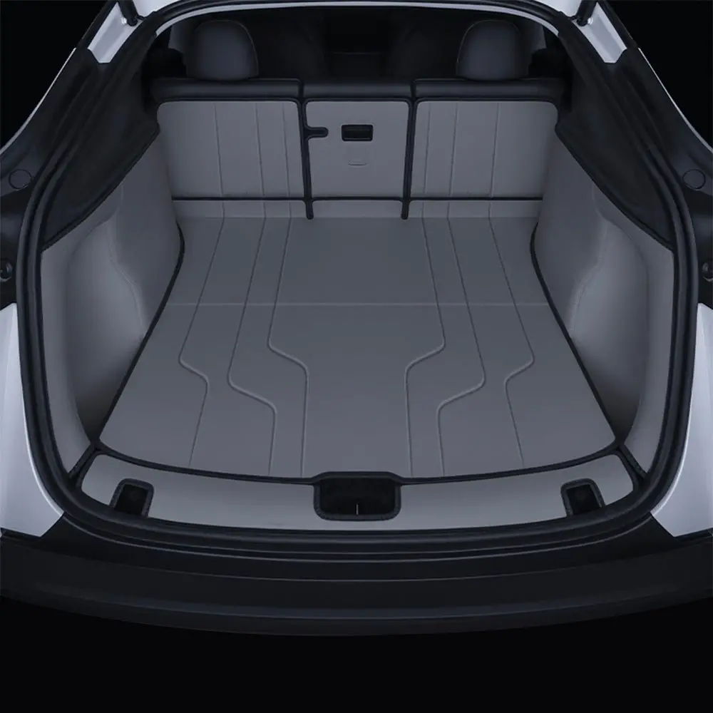
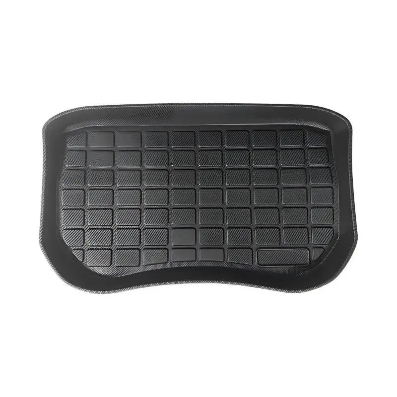
Nappa Leather Trunk Mat for Tesla Model Y Juniper
The one-stop solution for perfect protection and aesthetic upgrade of your Tesla’s front and rear trunks.
Core Product Highlights

1. Instant Interior Class Upgrade
The unique textured design instantly captures attention, upgrading your interior’s luxury feel and giving your Model Y Juniper a fresh, premium ambiance.

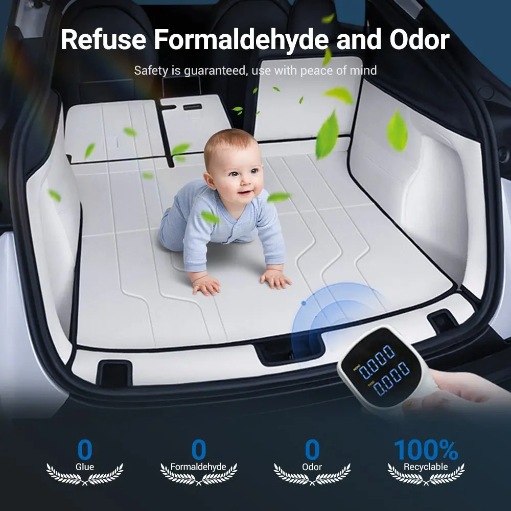
2. Zero Formaldehyde, Zero Odor
Manufactured without glue, ensuring 0 formaldehyde and zero toxic odors. Protect your health and provide a calmer, safer driving experience.

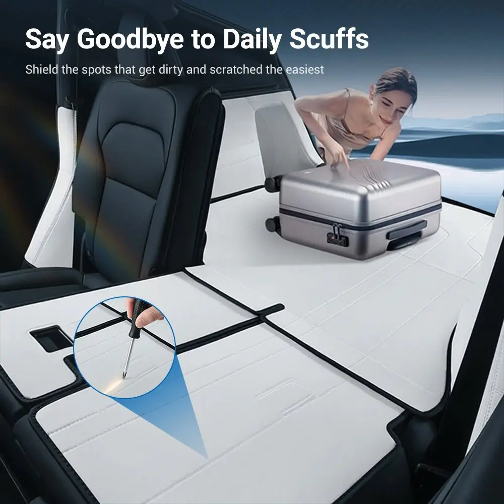
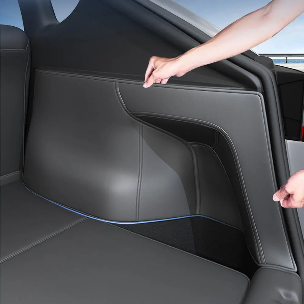
3. Raised Edge Comprehensive Protection
Innovative raised edge protection forms a 3D structure, better protecting the original vehicle carpet surface and preventing spills and dirt from seeping through.

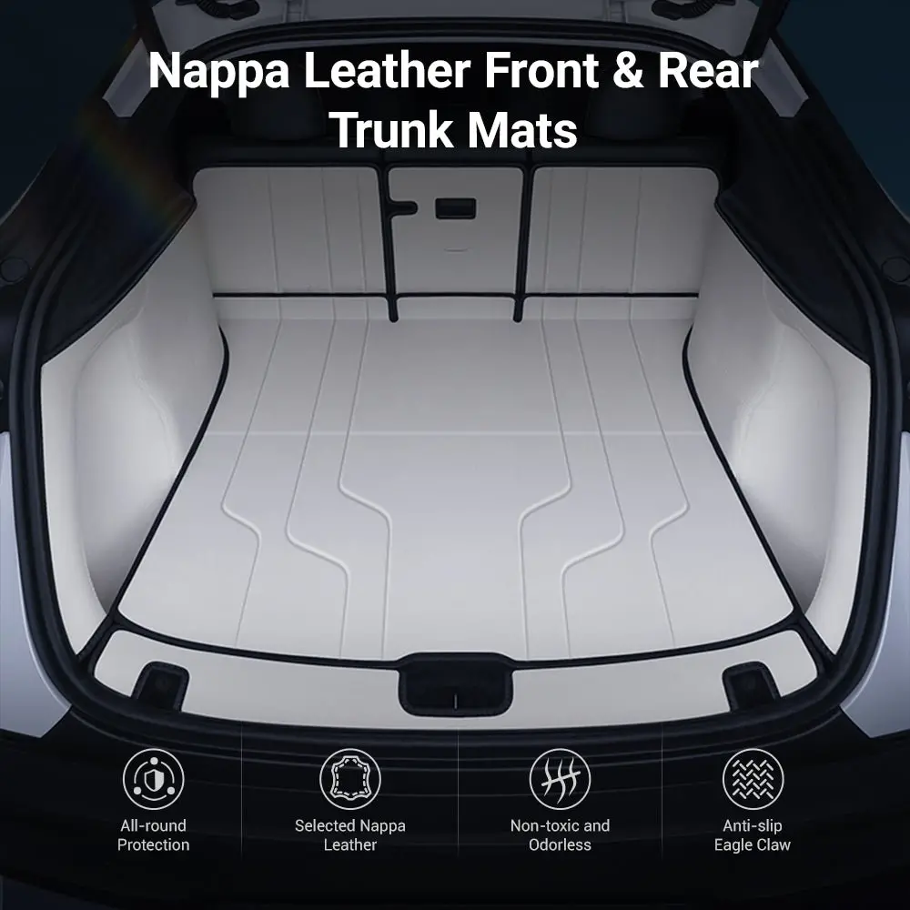
4. Premium Nappa Leather
Selected premium Nappa leather provides a skin-like soft touch. It is waterproof, stain-resistant, and scratch-proof, making daily cleaning effortless.

5. Encrypted Bottom Claw Design
The bottom features an encrypted “Claw” anti-slip design to firmly grip the original car carpet, ensuring the Tesla Model Y trunk mat stay securely in place without shifting.
Installation Guide & Component List (7-Piece Set)
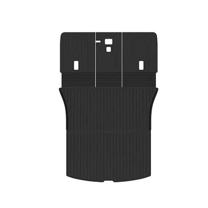
Product Component List (7 Pcs) Trunk Main Mat (Floor) 1 pc Rear Seat Back Mats 3 pcs Trunk Side Mats (Walls) 2 pcs Trunk Sill Mat (Entry Edge) 1 pc Simplified Installation Steps 1. Rear Seat Back Mats (3 Pcs): Clean the backrest area, peel off the adhesive backing, and precisely press the three mats onto the corresponding rear seat back surfaces. 2. Main Floor and Side Mats (3 Pcs): Lay the largest Trunk Main Mat flat on the main cargo floor, then place the two Trunk Side Mats against the walls. 3. Trunk Sill Mat (1 Pc): Finally, install the Trunk Sill Mat along the edge of the trunk entry to complete the installation.
Note: This is a 7-piece main cargo area coverage set. No tools are required for installation. Please allow 24 hours for any minor creases from packaging to fully smooth out.
Installation Guide Video
Frequently Asked Questions (FAQ)
A: This Nappa leather Model Y trunk mat set is precisely designed for the Tesla Model Y (2025.3-Present). It uses 1:1 original car mold data to ensure a perfect, custom fit.
A: Yes, Nappa leather has excellent waterproof and stain-resistant properties. You can easily clean it with just a damp cloth or wipe.
A: Installation is very simple and can be done by yourself. The mat uses a “Claw” anti-slip backing, so you just align and press it down—no special tools are required.
A: Absolutely not. We use an eco-friendly, glue-free process to ensure the product is 0 Formaldehyde and completely odor-free. It is safe for human health.
A: No, this is a 7-piece set specifically designed for the main cargo area of the trunk (floor, sides, seat backs, and sill). It does not include separate mats for the hidden upper or lower storage compartments.
Explore more from our collection.
Reviews
There are no reviews yet.